


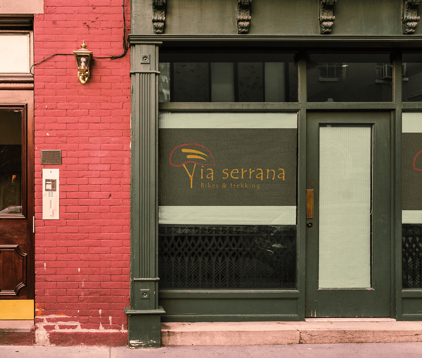
PT | Via serrana é a casa dos ciclistas de Belo Horizonte. Localizada na região centro-sul, a loja é especializada em mountain bike e artigos para trilha. A loja oferece uma gama de equipamentos, acessórios e vestuários para atender as necessidades dos apaixonados por mountain bike.
EN | Via serrana is the home of cyclists in Belo Horizonte. Located in the centre-south region, the shop specialises in mountain bikes and trekking articles. The shop offers a range of equipment, accessories and clothing to suit needs of mountain bike enthusiasts.


PT | O logotipo faz alusão ao capacete característico dos ciclistas, utilizando a alça do capacete para formar a letra “V”, que se integra ao nome completo da loja. As duas faixas dentro do capacete, representam as cavidades que permitem a ventilação, que ajuda a cabeça a ficar mais fresca durante o pedal. A palavra serrana significa originário das serras, condizente com as paisagens de Minas Gerais
EN | The logo alludes the typical bike helmet, as the strap was used to form the letter "V" which integrates the shop's full name. The two stripes inside the helmet represent the cavities that allow ventilation, which helps the head stay cooler while cycling. The word serrana means from the sierra, in keeping with the landscapes of Minas Gerais


PT | As cores escolhidas refletem o padrão mais observado nas trilhas de Minas Gerais, com o verde representando as vegetações típicas do cerrado, o amarelo representando os raios solares, e o marrom retratando a terra avermelhada, rica em minerais como ferro e magnetita.
EN | EN | The colours chosen reflect the pattern most commonly seen on the trails of Minas Gerais, with green representing the typical cerrado vegetation, yellow denoting the solar beams, and brown portraying the reddish earth, rich in minerals such as iron and magnetite.


PT | A tipografia escolhida foi Tempus Sans ITC, pois seus traçados irregulares, combinados com o contorno irregular do capacete, trazem a sensação de estar em contato profundo com a natureza. Para o corpo do texto, usa-se a fonte Raleway Bold, uma tipografia sem serifa que oferece boa legibilidade tanto em plataformas digitais como em ambientes offline.
EN | The chosen typography was Tempus Sans ITC, because of its irregular strokes, combined with the irregular helmet outline, give us the feeling of being in deep contact with nature. For the body text, Raleway bold was used, a san serif typography that offers good legibility on both digital and offline platforms.
EN | The chosen typography was Tempus Sans ITC, because of its irregular strokes, combined with the irregular helmet outline, give us the feeling of being in deep contact with nature. For the body text, Raleway bold was used, a san serif typography that offers good legibility on both digital and offline platforms.


Desenvolvido por: André Leite
soaresandre22@gmail.com


